Q&A: Formatting Series - Can I Use Artwork in My Script?
It is not very common to come across any kind of artwork in a screenplay. Typically, the film or TV script should be left to the visual interpretation of the director. So, generally I will discourage a screenwriter from using any form of clipart or stock photos in their screenplay’s cover design, which is the most common way a writer attempts to integrate artwork into their script.
While you may be able to get away with a professional cover design, you run the risk of alienating the reader if your design simply sucks. Better to do without than present poor quality.
I have also seen writers attempt to insert customized concept art, character images, maps or world-building designs into the script itself. This second attempt at integrating artwork is just one, big NO. Don’t do it.
It is tempting, especially for those larger fantasy or sci-fi worlds that are just asking for visual rendering. Perhaps the scope of the project is so compelling, it might feel like a disservice not to attempt concept art. But … a script is not a mood board.
Like I said before, a cover design can be done, if done professionally, but that’s about it in terms of artwork.
What a writer CAN do is integrate stylized forms of font to emphasize certain actions, sounds, text, or writings. This method can add texture to the page and step into the visual space without breaking any set rules.
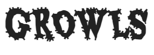
Don’t overdo the use of other fonts, however, and only implement in extremely sparing and specific ways. For example, is a monster GROWLS and that particular sound becomes their signature, then you can get away with a play on the font to allow the signature to stand out. A font, something like this:

Two rules: Do NOT use fun fonts for no reason and do NOT overuse those fonts … I cannot emphasize this enough. Otherwise, you’ll just come off looking like an amateur who should be writing comic books.
Remember, as a screenwriter, less is always more.
*Feature photo by Karolina Grabowska.

