Writer's Block? Your Workspace May Be the Cause
The last couple of years have seen an upsurge in writers and other creatives working from home, and in many cases, we're discovering that our workspaces are not equal to the task.
If your office has you feeling creatively stifled, anxious, or just kind of blah, there's actually quite a lot you can do about it.
But where do you start?
Some years ago, the company I worked for announced they were renovating the offices, and that the staff could choose new furniture and paint. Having a psychologist in the family, I've long been aware of the tremendous impact one's environment has on everything from morale and mental wellbeing to the quality of one's work. Consequently, I spent days deep-diving into the psychology of interior design for offices.
Here's what I found out:
Desk Placement
Many interior design gurus recommend facing your desk away from the wall and toward the door, both to increase a sense of space and to give a feeling of power/security.
It's worth trying if you can, but this placement isn't for everyone. For one thing, you need a pretty good-sized room to pull that off. I don't know about you, but I've never had a spacious enough office to attempt it. Fortunately, there are several alternative options.
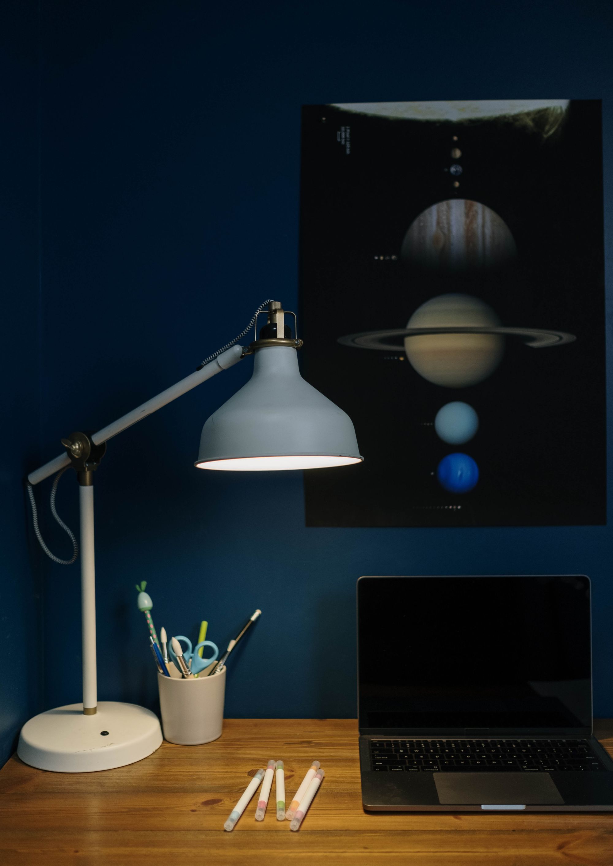
Windows & Lighting
Facing a window boosts creativity and optimism, and not just because it can make you feel less boxed-in. In addition to reducing the eye strain you get staring at your screen, occasionally looking out a window stimulates thinking and inspires new ideas. Gazing outside also lowers stress and improves mental health, although not to the same degree as actually going outside.
If you can't face a window (or if it looks out on dumpsters, like my last apartment), having a window off to one side will still provide natural light and the option of seeing outside when you want to. Just make sure the glare isn't shining directly on your screen or eyes, and that the ambient light isn't too bright to see your monitor (curtains and blinds help with this). I prefer to have both front and side windows if possible—and I figure if I'm really that distracted by yearning to go outside then it's probably time to take a walk anyway.
If none of those options are viable, then tacking up pretty fabric, curtain-lights, a set of white boards or corkboards with reminders and to-do lists, vision boards, paintings or posters, etc. can help keep you inspired and motivated.
You might have noticed that I mentioned curtain-lights above, and that's because I'm a huge proponent of indirect lighting. When there isn't sufficient natural light available, the use of string lights, track lights, and/or numerous accent lamps that create texture and depth all promote better moods and more creative thinking than flat overhead lighting schemes.
Color
Color schemes are arguably the most important decorating choices in the room, perhaps second only to ergonomic comfort. It's best to mix and match a little, but which colors are right for you?
Warm colors are energetic, happy, and stimulating. The emotions often engendered by these colors are:
Light yellow: Welcoming, optimistic, and cheerful. Light yellow is reminiscent of the sun, and promotes focus, innovative thinking, and energy.
Light pink: Inviting, cheerful, soft, caring, and open. Pink promotes communication and finds a happy medium of being both energizing and soothing, but it can also be seen as fanciful, feminine, or romantic—which you may or may not see as a plus. While commanding and exciting, red is recommended only as highlights/accents, as overabundance can promote anxiety or aggression.
Light orange: Stimulating and boosts energy like yellow, but as with red, it's best in small doses to avoid overstimulation and feelings of irritation or hostility. Some suggest the color orange also stimulates hunger.
Cool colors are soothing and relaxing. These are great for break rooms, but aren't always best for offices where you're trying to keep energy up and be creative—unless you're a high-stress personality and need the calming effects.
The emotions often engendered by these colors are:
Light blue: Security, optimism, serenity, and trust. Blue facilitates communication and contemplation, but it can also feel boring and stuffy, or de-energize you and slow productivity.
Light purple: Combines the soothing and regal qualities of blue with a hint of the energetic and cheerful qualities of pink. Purple has associations with sophistication, mystery, magic, luxury, and sometimes femininity.
Light green: More energetic than blue or purple, but more tranquil and balanced than a warm color. Green or green-blue can feel reminiscent of nature and outdoor spaces, but they can also be associated with sickly feelings, so it's sometimes best to use greens for accent furniture, houseplants, and other less prominent décor. Pastel green is cheerful, but forest or emerald greens can be more soothing.
Neutral tones are so called because they're seen as impersonal, conservative, and capable of flexibility in decorating. The emotions often engendered by these colors are:
White: Bright, open, blank. It can make a room feel more spacious, but it can also feel sterile and overstimulating if used to excess.
Gray: Heavy, conservative, and sleek, gray also conveys a sense of control and confinement that can feel boring or depressing, so it's not optimal for creative workspaces.
Beige/brown: Calm, stable, conservative, and neutral. Brown works for furniture and accents, but is not a great overall option. If you grew up in one of those 80s-decorated houses that's just ... so ... brown, you know the overarching use of brown tones can also be under-stimulating and dull. But, hey, if you dream of one day living inside a giant chocolate bar, more power to you!
Natural wood is the exception to this. Both a neutral and warm aesthetic, it can be used for anything from a luxuriant corporate style or an Old World library-study rich with crimson and gold highlights to a rustic, homey look. To some, especially urbanites, a liberal use of wood can feel overwhelming. For others, even entire houses made and furnished entirely in natural wood promote a sense of connection to nature, calmness, harmony, and an energizing connection to the outside world all at the same time.
TL; DR: Pastels and whites for walls and ceilings promote positive moods and a sense of openness. The most common suggestion for floors is dark, neutral or natural wood tones to avoid distraction and to feel more calm/stable/grounded.
Other Factors to Consider
Air quality: If there's one thing we've learned from decades of research, it's that having clean, fresh air is important for creativity, focus, and mental health. Opening windows if you're in a less polluted area, or using air filters and CO2 absorbing office plants if you're in an urban location (or during harsh weather), are sensible ways to passively boost your brain and body while you work.
Noise: Most of us have limited control over noise pollution from neighbors, coworkers, traffic and helicopters (I'm lookin' at you, Los Angeles!). Noise-canceling headphones and white-noise machines can help you focus, but white-noise is still noise. It still disrupts your thinking processes enough to be distracting and raise stress levels. Sound-proofing is another possibility, but it can be cost-prohibitive. The best thing, if it's an option, is to work somewhere that's as free of noise pollution as possible.
Working outside: Some writers sit at cafe tables or park benches typing away for hours, even in rain and heat. Some build a writing shed/gazebo in their backyard (I miss having a backyard!). Some even go hiking while dictating into a recorder and then upload via speech-to-text software later. I wish I was a “the wilderness is my office” kind of writer, but I'm not there yet. I can do ideation and little notes or outlines while out in the middle of nowhere, but I'm often a research-as-you-go style writer, so I need internet access to really knock out pages.
Customization is King
The office I was working in that inspired this piece did a combination of creative, social, and technical tasks for comedy content, so my pitch was for pastel yellow walls with white ceilings and wooden furniture. The pitch didn't win, but at least I can share the fruits of my efforts with you.
One last thing: no set of observations or suggestions from experts are the be-all, end-all of how to decorate your own workspace. If there's a color or style that you absolutely love, go for it! Same for furniture, flooring, and everything else.
So, are you ready to upgrade your office for maximum creativity? I hope so!
*Feature photo by cottonbro studio (Pexels)