

Writing in Shapes and Colors
Scatter my ashes at Legoland.
I LOVE Legos. I don’t play with them anymore because they’re kind of pricey and I’m not eight, but my affinity will always be there. I was never one of those freeform, abstract Lego kids, like so many baby Mozarts who create entire worlds out of thin air. I was a planner in need of a tried-and-true foundation, and stacking those blocks all willy-nilly stressed me out even then.
Naturally, my favorite part about Legos are the step-by-step illustrations. This is also why I love Ikea so much. My brain works visually when it comes to directions, and reading them is hard. Taking direction is even harder, but that’s entirely a me problem.
Cut to a decade later, where I’m sitting in a lecture hall learning how to write a screenplay. Syd Field and Blake Snyder and three-act structure and plot points and inciting incidents and the denouement and blah blah blah. So many words. Then, we got to the graphics. The line chart showing rising action, peaking at the climax, and then dipping down into a calm resolution. A circle chart, showing The Hero’s Journey; the main character returning home to a changed world. Some kind of squiggly line marking the highs and lows of a story arc.
Now we’re talking.
Once I wrapped my brain around all these shapes, I felt I had a pretty good grasp of the rules.
But rules are meant to be broken. I’m a firm believer that following the rules of screenwriting to the letter will garner you a very well-structured, very dull script. Never forget that human beings are at the receiving end of your work (for now, anyway), and you need to cater to them. You need to learn where the wiggle room is and how far you can push form in order to create an interesting read.
My first step was learning how the professionals broke the rules. If they can do it, I can do it, right? I downloaded the scripts for my favorite films and pored over them obsessively. My writing heroes became cowboys in my mind; they editorialized, wrote in prose, switched fonts.
All the rules were broken, and always to the benefit of the script. I learned that no matter what, the only thing that’s important is a good story, well-told. Period.
Next step, television.
My film school education was good except for one thing: we didn’t cover writing for television. Not once. And I ain’t that old, so it’s not like it wasn’t worth talking about at the time. I graduated in 2016—still very much in the New Golden Age of Television. We focused on three-act structured, Hollywood-style movies. That’s it. Goodfellas, Jaws, Die Hard, you know.
So, I graduated and decided to teach myself how to write a pilot. Television is a very different beast because not only do you have to structure one overarching plot, you also have to structure each episode to thread in to that larger one, and still have it all culminate in a satisfying, yet open-ended resolution with enough juice left in the tank to run for multiple seasons. Overwhelming.
Once again, I looked to the pros. I downloaded the pilot scripts for my then-favorite shows: "Mad Men," "Shameless," "House of Cards," and "Game of Thrones."
First, I went through each script and highlighted the different storylines—Yellow for A-plot, Green for B-plot, Blue for C-plot. Purple for the rare D-plot. The Teaser would be in red, and if there was a callback to it, a setup for the next episode, or a section on worldbuilding, that would be in red, too.
It’s important to stop here and remind you that I was doing this only for my personal pursuit of knowledge. I learn best by ripping things apart and taking a look at the inside. I had no clue then that I would be writing an article about this years later, so my methods are shorthanded and not watertight. Everything I say is meant to be modified to your own preference. Same goes for anybody sharing screenwriting “insight.”
With this caveat in mind, sometimes my highlighting of A-plots and B-plots looks more like highlighting A-characters and B-characters. Sometimes, it was more of a feeling. If a scene was a two-hander, I would ask, whose scene is this? Which character has the spotlight in this moment? And I highlighted accordingly. Really, I just wanted to get a feel for how much page real estate the writer devoted to each arc.
The plotlines in the pilot for "Mad Men," for example, are fairly separated by character. Don Draper dominating at work and in life is the A-plot, young gun Pete Campbell trying to prove himself is the B-plot, and Peggy Olson fumbling through her new job is the C-plot.
Now what happens if multiple arcs bump into each other or overlap in a scene? It happens all the time, of course. That’s good writing. There is no need to cut to a different location every time there is a new conflict, which is so often the case with screenplays that feel blocky or stilted. People don’t live a vacuum and your characters shouldn’t either. Most scenes have two or more characters discussing, fighting, plotting or learning about each other, so inevitably, there will be ripple effects that compound and extend outward.
Let’s take a look at my highlighting handiwork for Mad Men:
In this scene, Pete Campbell, Don Draper and the rest of the ad-men are celebrating a successful pitch. Pete sucks up to Don a bit and invites him to his bachelor party, which Don declines. The beginning of this scene, highlighted in green, is very much focused on Pete. When he exits, the focus turns to Peggy, our C-plot.
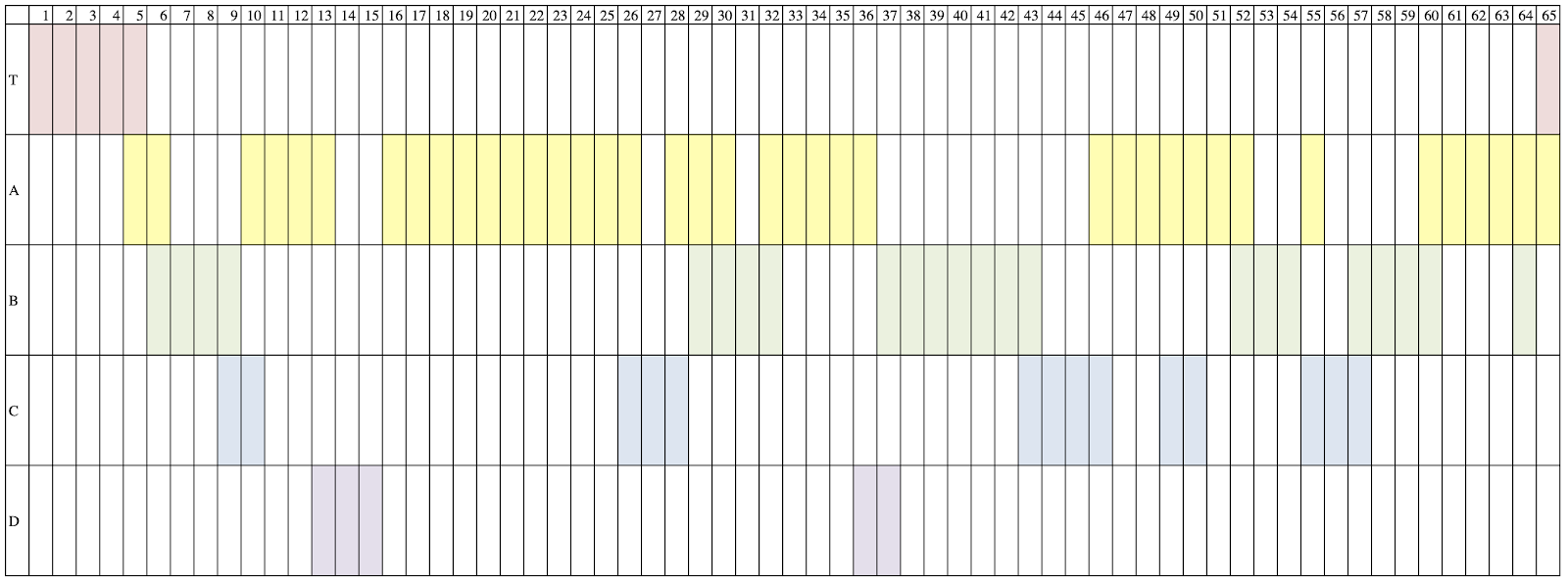
After highlighting, I realized I was terribly confused, scrolling through all these colors on all these pages. So, to further parse out how much screen time each arc was receiving, I took each of these highlighted scripts and made histograms.
Let’s stick with "Mad Men," for now:
Mad Men
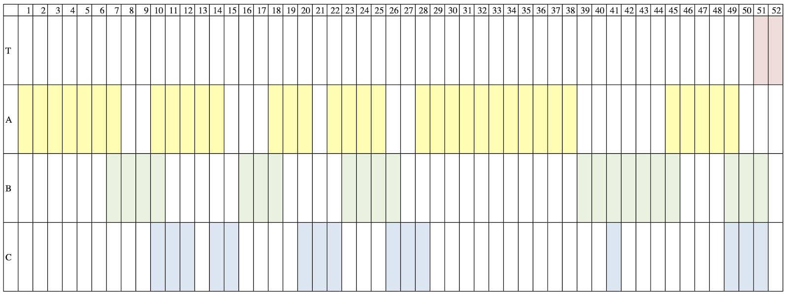
Just now, I had to ask my mom and Google if this is actually a histogram. Turns out, it’s not. But it’s close enough, and I’m doing this for you, so get off my back.
The ascending page numbers are the x-axis, and the Teaser, A-plot, B-plot, and C-plot make up the Y-axis. I then threw in the corresponding colored pages.
Here are the others, so we can see them all together.
Shameless
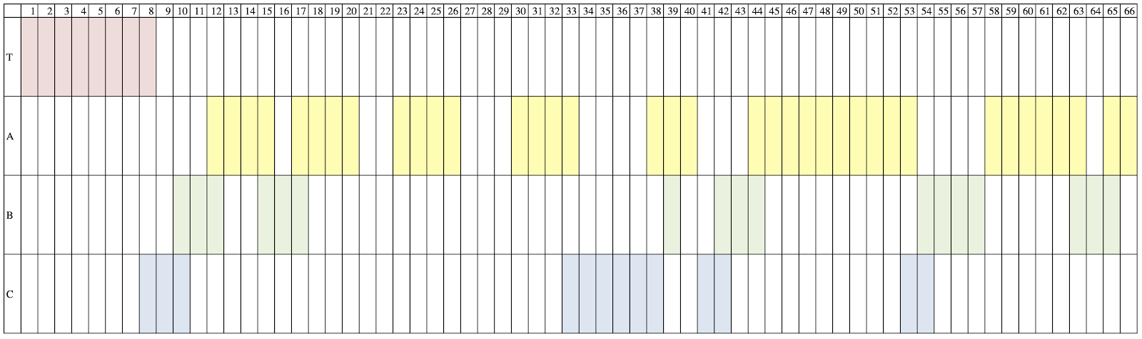
House of Cards
Game of Thrones
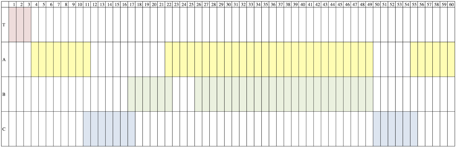
At first glance, each histogram has its own distinct look. In "Shameless," the Teaser comprises almost half of the first act; in "Mad Men," one doesn’t appear until the end. "House of Cards" has a D-plot, which the others do not. "Game of Thrones" is incredibly blocky, without much cutting back and forth, and the entire second act is an evenly-matched tension dance between the Starks and Lannisters in Winterfell.
But, if you zoom out your brain a little bit, you’ll see the similarities. The A-plot always gets the most screen time. The subplots often play together. The final act has to tie up all of the threads, often cutting rapidly between them or overlapping their scenes.
For all of these summarizations, you might think, ‘Well, duh. The books and gurus already told me that.’ Of course, they did! But did you actually get it? Did you understand the machine and why you feel a certain way after watching a show? I didn’t. Not until I did this exercise and saw the plotting.
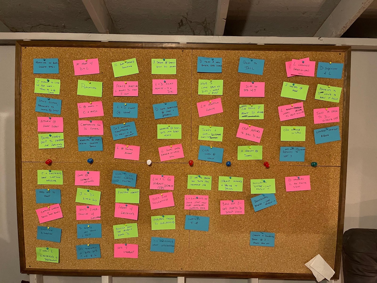
When writing my own scripts, I always employ visual methods. I’ll write a proper, black-and-white, boring outline, but I also need something tangible to bounce that against. I plot using index cards, virtual or physical, and those are color-coded for each arc. If two connect in a scene, I’ll staple two colors together and use that card.
The back wall of my shed:
After I’m finished with a first draft, I always go back to the outline and fill in how many pages it took to complete each beat. Every single time, I’m surprised. For me, it always takes fewer pages than I think to convey a moment. If the climax in my outline said, “John finds out Sarah betrayed him,” I would initially think that could be a good 4-6 pages. More often than not, I get it done in less. This is certainly not a standard everyone should write by, it’s just my own close-to-the-bone style.
Considering your page count is a good practice for everybody, because on the next one, you’ll have a more accurate gauge of your own pace. You’ll know, before you even begin, whether to flesh out or pare down your beats.
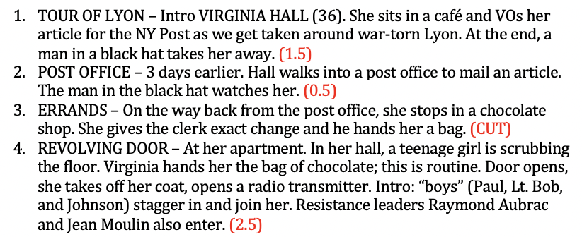
Take a look at this outline of an old Nazi script I wrote some years back. The page count for each beat is in red:
When you’re all done with your first draft, go ahead and make that histogram! It may not change anything, but it should be an interesting exercise. Maybe you’ll see an arc fleshed out in the beginning that never resolves in the end. Or maybe you don’t have any subplots and need a little more depth. This visual aid will point out any glaring issues that you can address for the next draft.
For me, breaking down my story into different data sets acts as a sort of fact check. It doesn’t necessarily tell me how or what to write, but it ensures that I have dimensional characters and a balanced plot.
These granular processes are by no means gospel, and you may have no need for them! In that case, sorry about your last ten minutes. But if you were an anal-retentive little Legoer like me, give it a whirl! It might just do the trick.
*Feature photo by Duc Anh Nguyen (Pexels)