Unleash Your Inner Director: Writing Graphic Novels vs. Screenplays
Oh, no. It happened again. Every time you get coverage or workshop your spec script, you keep getting the same feedback: Don’t include camera directions. You nod. OK. You get it. But then, deep down inside, you hear this voice saying, “It’s my story. And I gotta tell it like I see it.”
Which is fine. But before you scream and rush over to one of the few spots in your wall not indented by previous head banging, I’d like to suggest a less painful option. Why not try an art form where directing the camera isn’t just encouraged, it’s essential? Why not consider writing a graphic novel?
Worst case, you could learn some techniques that enhance your screenwriting.
A quick definition: Graphic novels are typically stand-alone stories with more complex plots than their shorter cousins, comic books. Once you finish this article, you should be able to start writing. But as with any art, you’ll need to put in further study to write like the pros.
For now, here’s some general stuff to consider:
All art is storytelling. Great art tells universal stories. By universal stories, I mean those where emotions reveal truths. And by art, I mean everything: comics, graphic novels, film, fiction, poetry, theatre, music, dance, photography, painting, sculpture. In every case, the artist tells their story by putting certain emotions into their art form. When the reader, viewer, or gallery visitor interacts with the art form and experiences the emotions/truths the artist put in it, then what I call the Circle of Art is complete. Your story is told. Emotions in. Emotions out.
The reason I think this is important is that too many writers jump into projects without knowing what their role is as an artist. Thing is, they’re counting pages, not emotional truths. So, before you start writing, I truly believe you’ve got to figure out what your story’s about—what will make it worthwhile for your reader/viewer to invest their time in your efforts.
You should take your art seriously.
To paraphrase Stan Lee: every story should have a meaning. Alfred Hitchcock said, “To make a great film, you need three things—the script, the script and the script.”
Michelangelo said, “I saw an angel in the marble and carved until I set him free.”
If creating a worthwhile story sounds like a lot of hard work, it is. Most professional screenwriters I know spend about two-thirds of their time “breaking the story” and the last third writing it. One thing that’ll make life easier for you is that you can take whatever beat sheet or screenplay structure you’re already using and scale it down to match the length of your graphic novel, which is not set in stone but usually 64 pages or longer.
If 64 seems like a lot of pages, you can self-publish and have total control over page count. FYI comic books typically run 22 pages of story, plus credits, advertising, etc.
Once you’ve got your story, you’re ready to start typing. But not the script. Not yet. First, you’ve got to become your own casting director and describe the characters you’ve created. You’ll need to do this in far more visual detail than is customary in a screenplay.
Be sure to include any physical quirks that might impact your story. Why? Because these descriptions will be used by your artist to draw your cast.
Now that you’ve got your story outline and character descriptions, you can either start writing your script, or first, have an artist bring your characters to life. If you’re collaborating with an artist, there’s no expense. If you hire an artist, you should plan to pay them right away. While it’s always fun and inspirational to look at your characters while writing—you might even ask them for advice—your starving-writer budget may not have room for an artist. No problem. There’s no harm in waiting until the script’s done before looking for an artist. Waiting will also give you the opportunity to let your characters evolve and for you to decide whether you like your story enough to invest your hard-earned cash in it.
And finally … on to your script!
Graphic novel formatting is very different from screenplay formatting. Knowing what you plan to do with your script when it’s done will help you choose the right format. If you plan to submit to a publisher, follow their guidelines. Use their templates. Confirm they’ll consider scripts without art (if you don’t have it). If you plan to go the indie, self-publishing route, you can use any format you want.
Final Draft 12 (and maybe other versions) has graphic novel templates. Click on the File tab, then New from Template, then Graphic Novel, then pick a template and you’re on your way. Free templates might be available online.
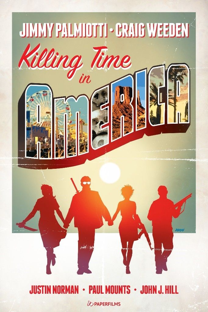
I learned graphic novel formatting—you’ll find samples below—while collaborating on Killing Time in America with Jimmy Palmiotti (Harley Quinn, Painkiller Jane, Deadpool, Black Panther). Our format is not “industry standard” but, Jimmy being Jimmy, nobody complains.
One major, throughout-the-project benefit of our formatting is that page 17 in our script, for example, will always be page 17 in the book (until the Book Designer adds title pages, copyright info, etc.). We work to keep the script and book page numbers the same. White space is kept to a minimum. Font size might be reduced to squeeze the text onto a single page. By contrast, if you use the Image Comics format, it might take three script pages to write one book page. Which can make finding the correct page confusing when you’ve got a lot of people involved.
A lot of people? Yes. As with filmmaking, graphic novels are a collaborative effort. Along with the Writer/Director, you’ll have two Artists (pencils and inks, although the same person might do both), a Colorist, Letterer, Book Designer. If you don’t have an artist in mind, you might want to write your script to its end before looking for one.
However, if your book is a joint venture, or you’ve previously worked with an artist, this is where having the script page match the book page really pays off. Multiple people can work on the project simultaneously with minimal chance of page numbers screwing up the process. Once the pencils are done and approved up to, say, page 20, you can have the first 10 pages of inks done. Then when these inks are done, you might have the colors started. Ultimately, the book will move along more quickly than if you went through each phase in a linear fashion.
A caveat: Don’t start the colors or letters until you’ve verified that the art matches your script and/or that you’ve modified your script to match the wonderful and unexpected take the artist (pencils) brought to your vision.
Now, flex those fingers. It’s time to UNLEASH YOUR INNER DIRECTOR.
Type PAGE 1. Drop two spaces. Type PANEL 1. The size and shape of this panel and everything inside it is your call. Where are we? Day or night? Who’s in the scene? Who’s in the foreground? Background? Where’s the camera? Since it’s Page 1, is it a splash page? Does anyone speak? What do they say?
When you’re done, type PANEL 2 and repeat, or jump to the top of the next page and type PAGE 2.
A few tips: Don’t over-direct. Give the artist room to be creative. Sometimes, Jimmy and I will be very specific about what needs to be in a certain panel. Alternatively, we might write that a particular event occurs in the next four panels, and let the artist run with it.
We generally avoid calling out panel shapes and sizes (other than WIDESCREEN—½ PAGE) unless these are crucial to emphasizing a point in the story. Other than that, the artist shapes the panels to suit the art. Reference photos are usually appreciated by the artist.
A great way to learn is to study the visual storytelling and panel shapes/sizes in graphic novels, without reading the text.
Sequential art is the heart of graphic novels (and comics). Be sure you and your artist know what it is. And be sure your artist knows the difference between illustrating a story and visual storytelling.
In each panel, you’re describing a frozen image which depicts action. So, you’ll be using -ing words: He is running. She is smiling. In a screenplay, -ing is generally avoided because you’re describing moving images. So: He runs. She smiles.
A fun fact: Jimmy and I wrote the screenplay first, then decided to write the graphic novel.
And at long last, some examples.
The following script pages and corresponding finished pages are from Killing Time in America. Written by Jimmy Palmiotti & Craig Weeden. Artwork by Justin Norman. Colors by Paul Mounts. Lettering & Design by John J. Hill. Cover by Dave Johnson.
Logline: When a spate of murders at a beach resort in Florida duplicate the pattern of his wife and daughter’s deaths, a retired detective’s revitalized search for his family’s killers leads him to a cult in a remote Bavarian village.
What Killing Time is about: Under its violence, our story is a morality tale about how a legitimate quest for justice can be perverted for diabolical purposes.
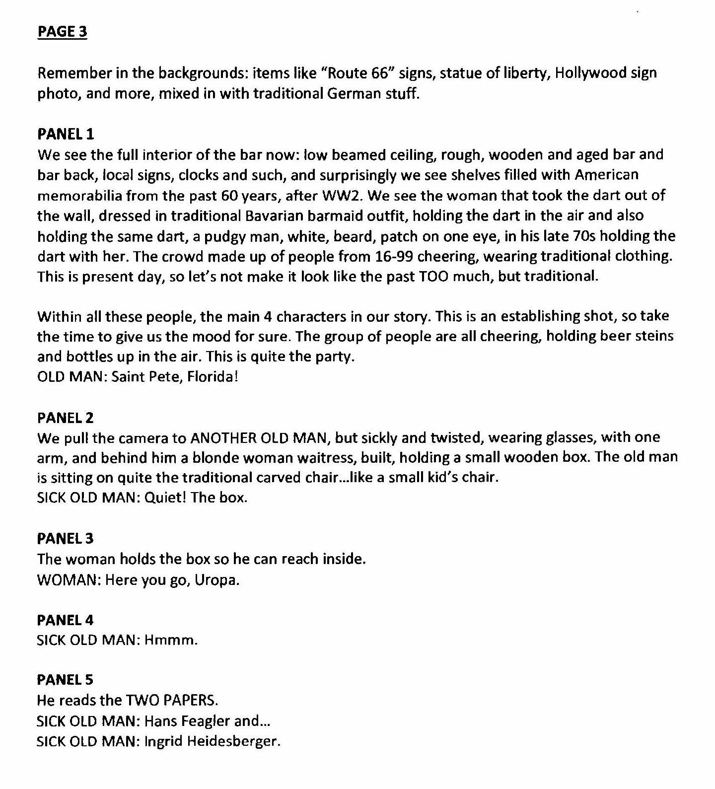
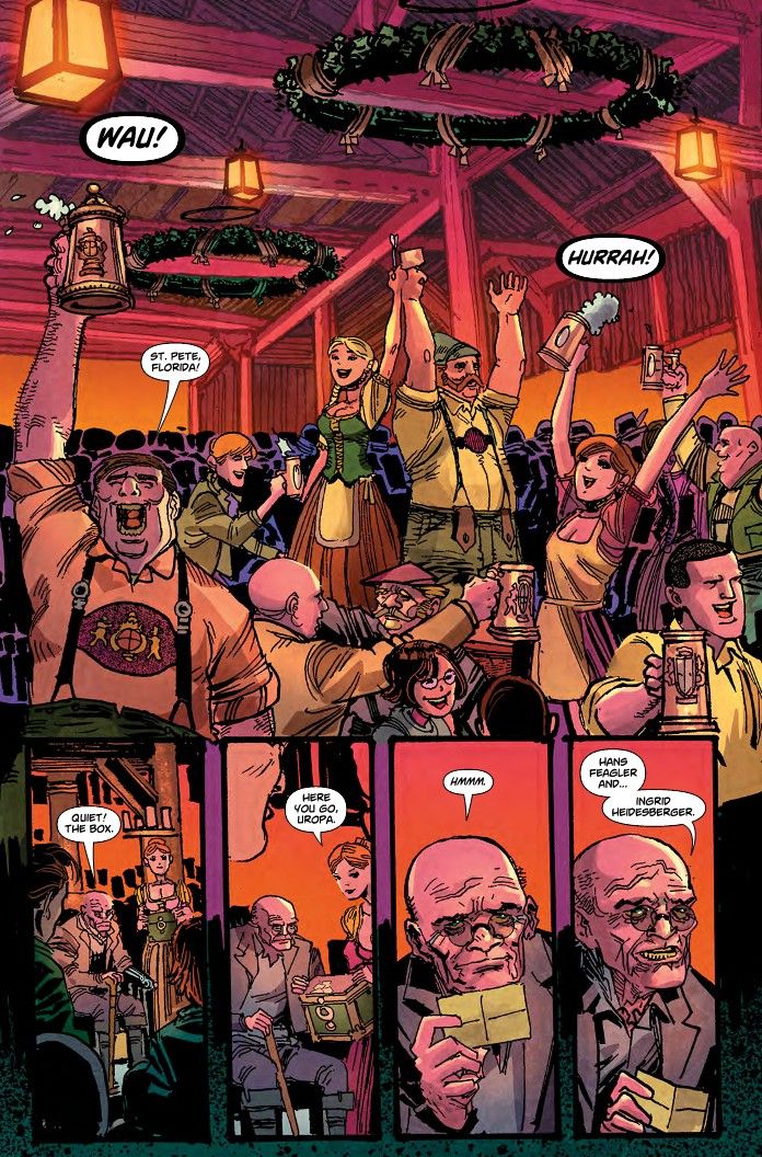
Once you’ve built your world, writing moves more quickly.
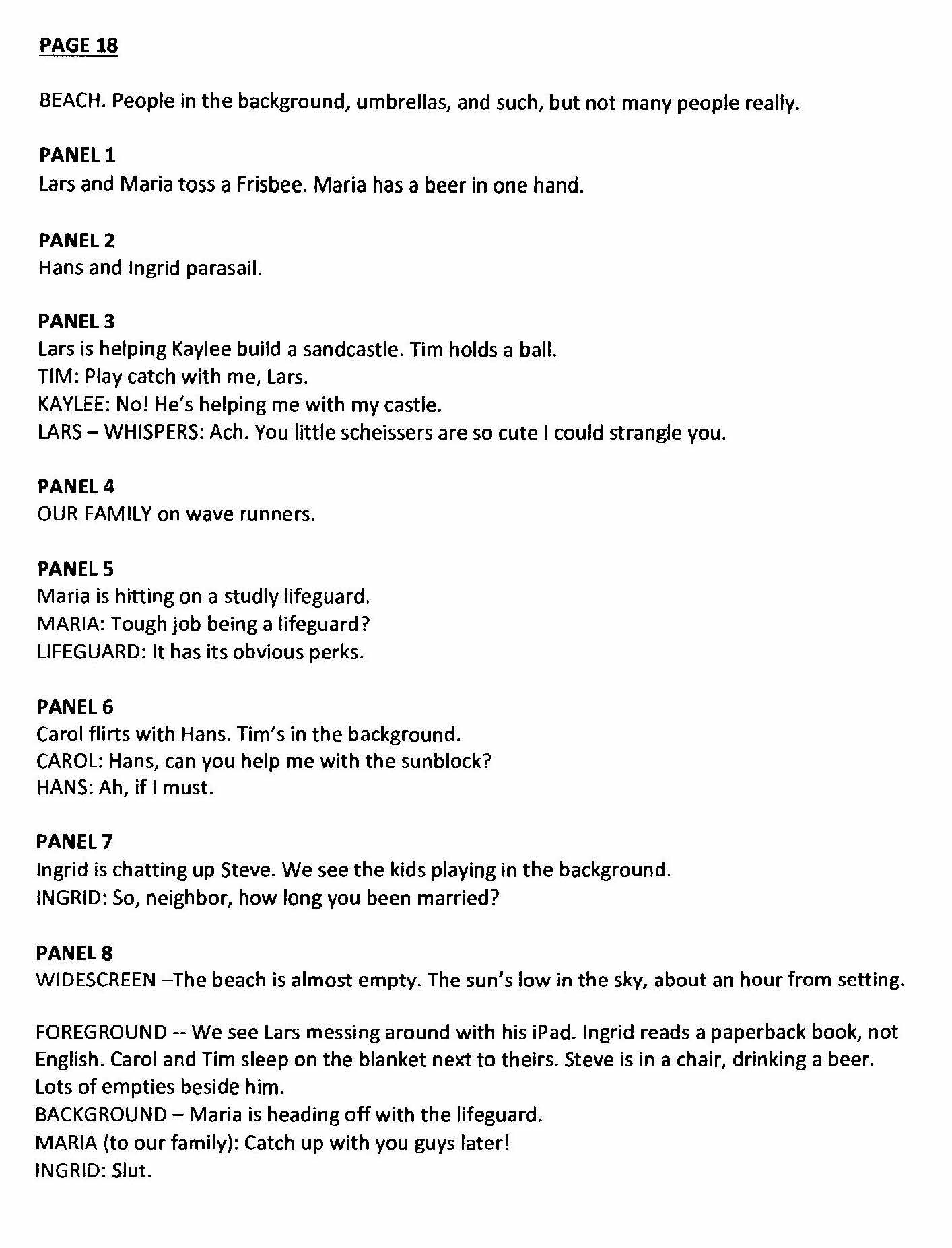
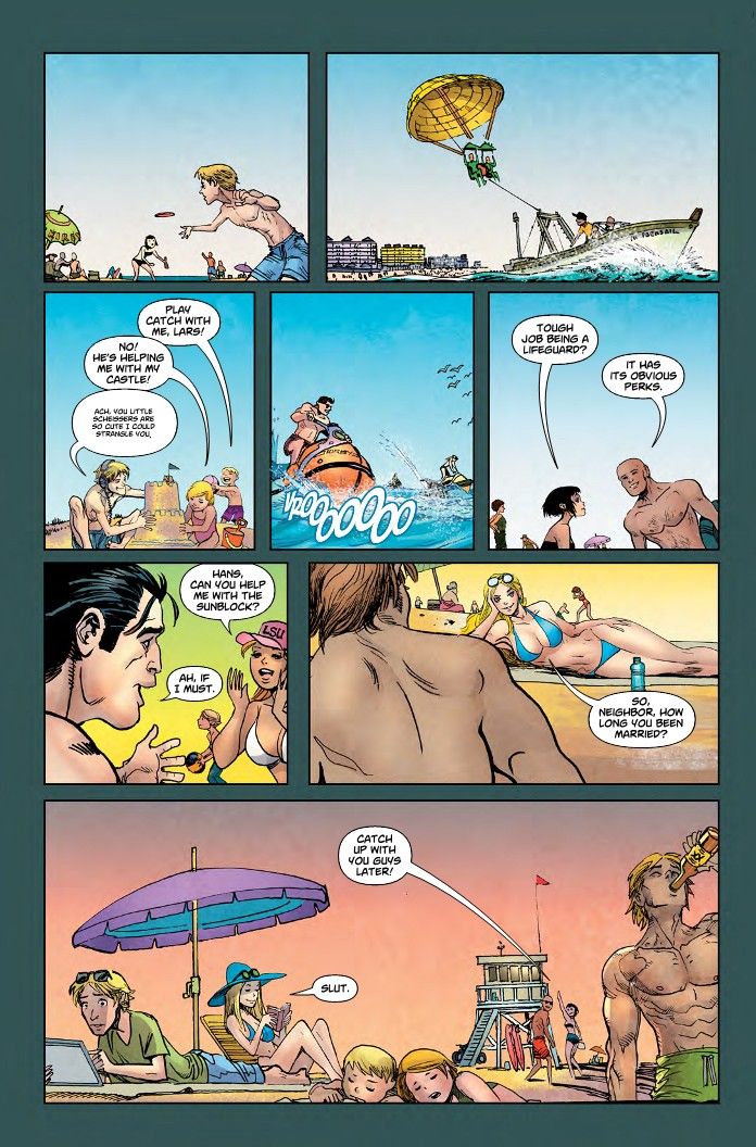
And when you’re done, you might have something like this:
