Adapting a Screenplay Into a Graphic Novel: Directing on the Page
All right. You’ve done your research and written your script. Finally, someone’s going to transform all those beautiful words into beautiful pictures.
This is when things get real. And exciting. Sure, why not—really exciting. You’re about to embark on the graphic novel equivalent of “Principal Photography.”
LET THE HUNT BEGIN
Before you can find the right artist, consider the genre and tone of your story. What’s the best visual style to represent it?
For Blowback, we were interested in a realistic, traditional look. But you might like a more stylized approach. Maybe cartoonish. Maybe noir. Use this to focus your search for an artist working in that particular style.
Beyond style, co-creator, Rhonda Smiley, and I wanted to work with someone that had a list of published credits. For one, they know what it takes to get a full book completed. But also, since we were first timers in the medium, a veteran artist could provide a reputation and potential fandom that might draw attention to our project.
Consider if the cost of an experienced pro is more valuable to you than a (likely) less expensive up-and-comer.
We started our search by looking at books at our LCS (local comic shop). Indie books, mostly, as that seemed like the best place to find someone open to freelancing.
We left with several trade paperbacks in hand and a list of about six artists who seemed like a good fit. Thankfully, many have their own websites or social media with contact information or forms. This is what they do, after all.
When reaching out to artists, describe your project, including the number of pages and any other relevant details (ours involved objects and clothing from three different time periods). Also talk about your goals regarding target dates.
If a candidate shows interest, follow up with a discussion about rates. You should ask them their quote, but it’s a good idea to already know what you have budgeted for it.
A search for page rates online led to estimates ranging from $150 to $650 a page, all in. This isn’t surprising since the experience, talent, marketability, and availability of artists varies so wildly.
In my very rough analysis, the total page rate breaks down as 40% for layout/pencils, 30% for inks, 25% for color, and 5% for lettering. There are artists who may only do one or two of those stages, and there are others who will do them all.
Remember to be a conscientious creative. Beating an artist down to the lowest rate possible shouldn’t be the goal. A fair rate that considers the value and time of their work should be what you’re trying to hit. As with writing, an offer of “exposure” in exchange for free or minimal payment is rarely worthwhile.
Several artists we contacted replied that they weren’t available. Which was an improvement over the others who didn’t reply at all. The silent "no" is apparently popular across all of entertainment.
Ultimately, an industry friend of an industry friend connected us to Kev Hopgood. Kev had the style we were looking for, along with an impressive resume and a hand in creating War Machine and Hulkbuster for Marvel.
If you’re short on industry friends, you can also find artists on social media, where plenty display their work and post availability. Facebook, Twitter, Instagram, and even LinkedIn have artists and artist groups. There’s also the website DeviantArt, which bills itself as “The Largest Online Art Gallery and Community.” A digital portfolio, in other words.
GET IT IN WRITING
Once you find someone, it’s time to be business savvy and hammer out an agreement. If you’ve got the finances, I’d recommend using an attorney. But at the very least, make sure to get the major points of your collaboration established and agreed to on paper. Signed paper.
This should cover the number of revisions, schedules, turnaround time (for production, notes, and payments), as well as ownership. Is this a work-for-hire or are you creating a partnership? Sharing the I.P. may be appealing to writers who have a more modest budget, but for us, controlling the property (and avoiding the complications of accounting), was well worth the price of a buyout.
It’s also important to establish what’s included beyond the pages themselves. A logo perhaps. Front and back cover along with spine, probably.
Regardless of the agreement, expect the schedule to—like home renovation—take much longer than estimated. I think artist estimates are earnest, but optimistic. Real life is less so.
Our artist, Kev, took on everything but color, which was handled by Charlie Kirchoff.
For our pipeline, we went in ten-page increments, through all stages, then circled back and started the next set. Once we signed off on the final inks for each ten, we passed them along to Charlie to start coloring while Kev went onto the next ten layouts.
FINAL APPROACH
Before actual pages begin, the artist should create character models for your primary cast, as well as any unique or unusual design elements in the book.
Although a group of friends, family, or coworkers can look similar in real life, you should make it easy for readers to know who is in each panel right away. Unique identifiers like hair color and length, facial hair, glasses, genders, ethnicities, and clothing choices are all useful tools.
Once you’ve approved the character models, these will serve as a reference throughout the book, maintaining consistency.
Speaking of references, if you have any images you’d like to pass along for your models (or anything in the book), you should share a folder with those files. Include a page and panel number in the file names to clarify what they’re for.
What are your page specs? This refers to the size (and most importantly—aspect ratio) of your final product. This is critical to effective printing, though there’s always a chance they end up changing. Your artist will need to know what page dimensions their panels should be drawn on. To oversimplify, you don’t want them to be laying out images on a landscape aspect ratio when the final print version will be portrait.
Will you have bleed pages? Bleeds are when art continues to the edge of the page, as opposed to having it all contained in bordered panels. Bleed pages are created larger than the final dimensions and trimmed in the printing process. That means you’ll lose some art at the edges. Of course, it’s designed and drawn with this in mind, but it still felt tragic to me.
We asked our artist to use the industry standard specs of 6.625” by 10.25” (after trimming). When we ultimately ended up self-publishing through Amazon, though, we discovered they had a different standard size. It required significant reformatting of our pages, which was not fun.
In most cases, you won’t have a publishing deal before you start production, so if you’re going to try to get traditionally published once you’re done, consider the standard. If you plan to self-publish from the start, make sure to get the specs from whatever printer or print-on-demand company you intend to use. It’ll save you a lot of headaches in the end.
If you’re only releasing digitally, this may not be an issue. But even then, you should refer to the platform you’re planning to release on and see if they have any requirements.
THUMBNAILS/LAYOUT
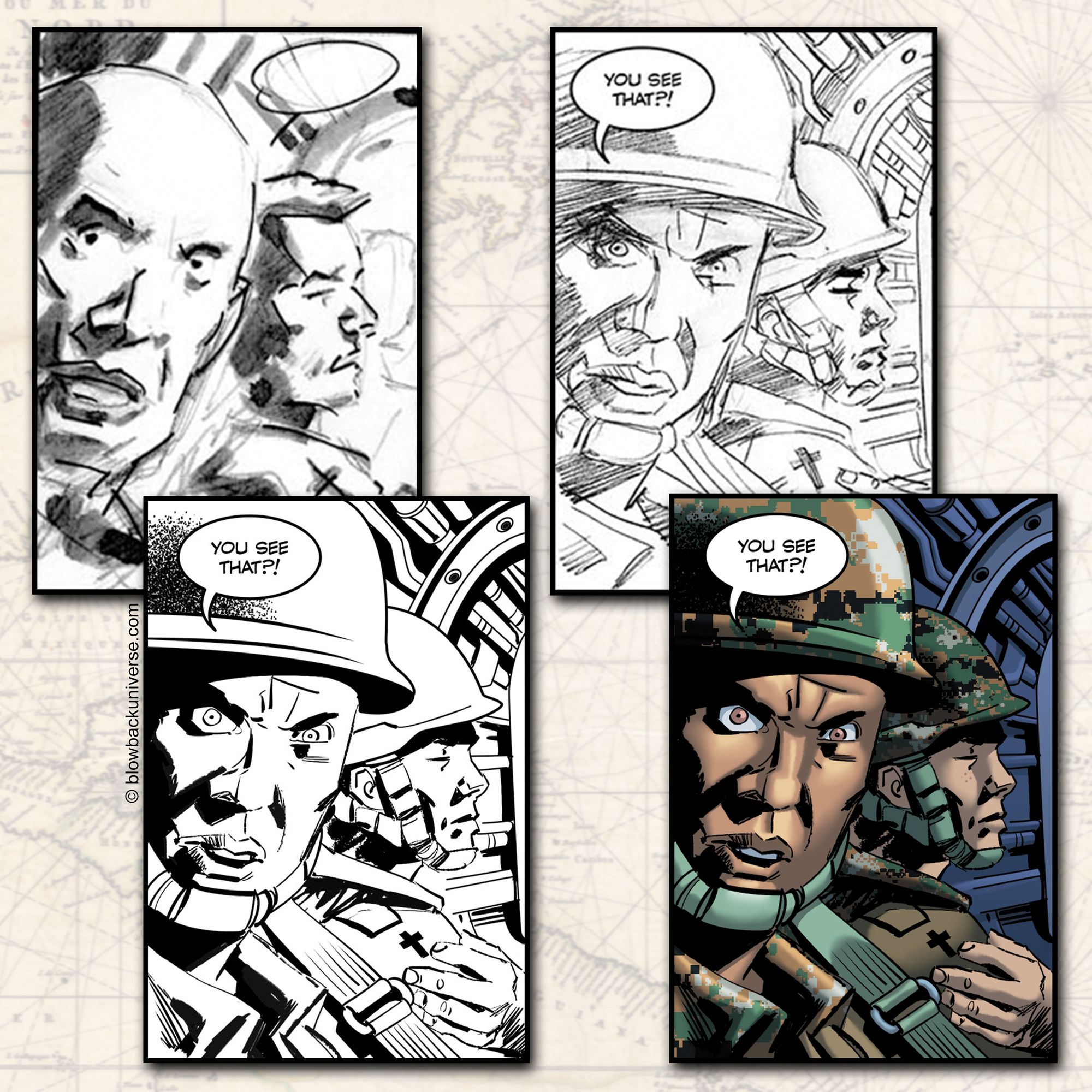
The first pages you get back from your artist are called thumbnails or layout.
Our artist drew them on paper, but they were emailed as digital scans. We printed the pages as they arrived to approximate how they’d look in their final form.
Although lettering typically happens after color, Kev was doing both jobs on our book, so he dropped it in from the start. It was great because you could see right away what was going to be blocked by balloons. And for Kev, he was able to balance his images as he composed them.
Here’s where you need to focus on whether the story is playing out like you imagined. Major revisions in the next stage are more difficult due to the detailed artwork involved. So, if you need any changes to the number of panels, the composition of those panels, or how they’re laid out on the page, this is the time.
In your notes, make sure to specify the page and panel number they’re referring to. Unless they’re very complicated, I recommend having your artist address them in the next stage instead of doing a revised layout. This moves the process along faster and avoids unnecessary work.
PENCILS
Pencils are much more comprehensive versions of the layouts. These are the drawings that will be inked over for the final versions before color.
Have your layout notes been incorporated? Make sure your characters are staying on model. Look for continuity issues. Do the characters that wear a watch have them in every panel? Are they on the correct wrist? Same for other small details, like gloves, glasses, or jewelry.
Are the actions clear? Are the character expressions conveying the right emotions?
If you’re using a different artist for inks, get the notes resolved with revised pencils. If it’s the same artist, then you can get most revisions incorporated into the next stage.
INKS
As this is the final stage in the process for the artwork before color, most revisions should get resolved in inks before you approve the page.
If you’re producing your book in black and white, though, congratulations. Your art is complete! All that’s left is the lettering.
For the rest of you, things are about to get colorful.
COLOR
It’s amazing to see the color pages. Shadow, light, and dimension take an extra step forward.
If you’re inclined, you can direct the color stage to be about more than making jeans blue and roses red. It can enhance mood and tone. A scene with emotional turmoil can be dark and angry, while a joyous moment can be saturated and bright.
The color palette can also be used to help establish shifts in locations and time. We found this especially helpful when settings changed in the middle of a page. Even the time of the day can tell part of your story, with sunrises, dusk, and starry nights all providing different looks.
A good (and willing) colorist can also make some last-minute fixes to problems not noticed during earlier stages.
Late in the game, we realized we had the wrong character in the background of a panel. Thankfully, Charlie agreed to color him as if he was the correct one, including adding suspenders. While not perfect, it was a definite improvement and big relief.
LETTERING
As mentioned in the previous article, the fewer words you can use to effectively express your story, the better. If you realize there’s a shorter way to say a line, even at this point, be sure to give your letterer the update.
You can even do some minor rewriting here. Obviously, you don’t want to inadvertently unravel your entire script, but this is a last chance to clarify, correct, or punch up your dialogue.
Regardless of what words end up in your balloons, though, make sure they aren’t covering any important details.
As for sound effects, not every bit of “noise” needs to be represented. But make sure to include the bits that help clarify what’s happening and evoke sounds in the reader’s imaginations.
BOOM! CRASH! BRAKKATTA! BRAKKATTA! BRAKKATTA!

And with that, you’ve done it. You’ve produced a graphic novel. Regardless of whether you sell one or one million, you’ve done something pretty amazing. And no one can take that away from you.
Once you’re done celebrating, get ready to take your baby out into the world with “Part Four: Publishing and Release.”
*Feature photo art by Kev Hopgood with color by Charlie Kirchoff