
Adapting a Screenplay Into a Graphic Novel: The Script
Part Two
Now that you’ve done your research and picked the screenplay you’re going to adapt in Part One, it’s time to start the script.
OK, you can do the dishes first. And the laundry. And check Instagram. But then, seriously, we have to get to work.
Are you vacuuming right now?
All right, if you’re finally all out of other things to do, let’s write.
TRIM THE FAT ... AND ALSO THE LEAN
Your screenplay is too damn long. Not for a screenplay, of course. Every movie these days is, like, two-and-a-half hours, right? But for a graphic novel, I can almost guarantee it’s too long.
My recommendation would be to shoot for around a one hundred page script. That means comic pages, not script pages. We’ll get more into that later. But first, let’s talk about why you want to keep page count manageable.
Unless you’re the artist, or are partnering with one, you’re going to have to pay someone to draw and color every one of those pages. The more you do, therefore, the more it will cost you.
Creating art takes time. With every additional page, the production schedule gets longer. And the longer it takes to produce, the longer it will be before you can bring your project to market.
The cover price will also increase with page count. Longer books cost more to print and ship. Not great for enticing readers.
Have I convinced you yet?
I know every writer thinks they’ve already trimmed the excess from their scripts, but you need to dig deeper. Are there extraneous scenes? Maybe even a subplot or runner the story could do without.
Dialogue should especially get put under the microscope. Is there a shorter way to say things? I think most of us have written a draft tweet we’ve had to edit down to finally fit. When it comes to particularly wordy areas, think in those terms.
Keep in mind that a comic or graphic novel is primarily a visual art form. Too much dialogue can overwhelm your panels. Lots of words = less art.
I’m not suggesting you render your screenplay unrecognizable. You should make sure all your story comes across, of course, and well. But don’t let your scenes drag. Make sure there’s nothing redundant. All the usual screenplay advice goes here. But more so.
Once you’ve finished streamlining your screenplay, you have to start thinking visually.
INSTALLING PANELING
The primary building blocks of a comic or graphic novel are panels. What you fill those with, and how you lay them out will largely determine how your readers experience your story.
Your task now is to break down your screenplay into those panels.
For Rhonda and me, the easiest way was to work with a hardcopy, though you can certainly do this in Final Draft.
Picture the action and dialogue in each of your screenplay’s scenes. Then mark a line between each beat you envision would constitute a panel.
Keep in mind that a single panel can only really represent one action. While it’s true that you can sometimes cover multiple beats in one stylized drawing, for the most part you’re capturing one moment in your story’s timeframe.
Don’t worry if you’re not one hundred percent sure of each panel during this process. You can combine and break things differently after you circle back to the beginning. Like with a screenplay, a lot of the most important work is done in the later passes.
Once you’re happy with the result, it’s time to compose pages.
Here, you need to think about what can even fit on a page. Consider that you’ll want some of those panels to be larger than others. A character opening their eyes will likely take up much less space than the Normandy invasion. It’s obviously not one-size-fits-all.
Take a moment and crack open those books you bought for reference again. How do they lay out their art? When does it look best? When does it look too busy?
A loose guideline is that a page shouldn’t have more than nine panels. There are exceptions of course, but for the most part, the readability will really begin to suffer with more than that. As it is, nine panels are a lot. Try not to have too many nine panel pages in general and definitely not too many in a row.
Now, I’m sure that writers who regularly work in comics have a good understanding of what fits on a page and can comfortably write their scripts without this much process. But that’s kind of a high bar for first timers.
For me, I took some extreme measures. I wouldn’t really recommend this next step, but as we were settling on our page compositions for Blowback, I felt I needed to confirm it would work properly. To do that, I roughly drew my own version of each page. One hundred and ten of them. Glorified stick figures, perhaps. But it helped clarify how our layout would look.
Our artist thankfully never saw my drawings, but between the screenplay and my sketches, it helped reassure that our graphic novel script should work.
THE SAME BUT DIFFERENT
At this point, you need to reformat that notated screenplay into the script you’ll hand off to an artist.
So, is a movie script the same as one for a comic or graphic novel? No. But there are similarities. Unlike in screenwriting, though, there’s no one industry standard.
If you already have an artist aboard, you should see if they have a preferred format. If so, they can likely provide you with a sample to reference.
In our case, we researched what kinds of formats were out there in general. A few internet deep dives provided numerous examples. Two that seemed the most practical and professional, came from a Jim Zub blog entry, and Blambot’s Nate Piekos notating Fred Van Lente’s method.
Ultimately, we developed a hybrid template we felt incorporated the best bits we’d seen ...
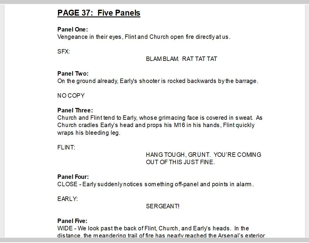
Graphic novel page number goes at the top, followed by the number of panels (each graphic novel page might take more than one script page to cover. Blowback is 110 pages. The script for it is 226).
If there’s something that needs to be pointed out about the whole page, you’d put it in next. Possibly layout information—panels one and two should be wide and shallow, with three smaller panels below, etc.
Each panel is numbered and followed by a description of what’s in it. If you have a particular type of panel in mind, you’d write as much—Wide, Narrow, Close, Establishing. If there’s a location, prop, or other bit of specific imagery you want to include, it’s a good idea to provide an online link to a reference.
Dialog is listed when applicable. If there’s no dialogue in a particular panel, you write “No Copy” to clarify that it’s intentional. Writing dialogue in all caps allows the Letterer to cut-and-paste.
The “thought bubble” has fallen out of favor in contemporary comics. Instead, Captions are used to represent thoughts. It’s identified as such and laid out like dialogue in the script.
Sound Effects are broken out like dialogue as well. Generally, your SFX are going to be what you mostly think of, and/or have seen before. Onomatopoeia. If you can’t think of how to represent a sound in words, try flipping through existing books for potential examples.

To oversimplify, the goal is to create a clear guide for the artist on what each panel should cover.
When you need things to happen or look a very specific way, write it out. But when that isn’t critical, be more generalized with your descriptions. Let the artist do what they’re experts at—framing/composition/expression. Tap into their creativity and be open to suggestions. Your book will benefit.
REAL ESTATE MANAGEMENT
One of the interesting things I learned in this process was that you should try to arrange any big reveals to land on the first panel of even-numbered pages. This allows the surprises or shocks to come after the page is turned, and not have them spoiled by the reader’s peripheral vision.
The importance of placement also serves as a warning. Unlike a screenplay, once you’ve laid out your pages, adding or cutting panels can impact how everything is positioned down the line.
If you cut a panel, an easy fix is to reallocate the space by making one or more of the surrounding panels larger.
If you add panels, on the other hand, things can get dicey. Do you just make all the surrounding panels smaller? Maybe, but they might be small already (Pro tip: Your panels should always be visible to the naked eye).
If you’re a decent number of pages away from the next significant reveal, you can potentially slide all the panels one slot later until you reach a page that can support adding a new one (not one with nine already, for example).
A bolder fix might be to insert two pages (yes, two, so you can maintain all your following odds and evens) and intersperse new artwork between that added panel, and the next “page turn” reveal. That’ll cost you in production, but the execution might be worth the investment.
Speaking of that, now that you’ve invested a little blood, sweat, and tears into crafting your script, you get to move on to the next creative payoff.
Start picturing your book in “Part Three: Directing on the Page.”